Pie Chart / Donut Chart The Pie Chart / Donut Chart components in the Material Charts Flutter package are essential tools for developers looking to create visually appealing and informative data visualizations in their Flutter applications. These charting solutions excel at representing data proportions and percentages, making it easy for users to understand the composition of a dataset at a glance. With customizable segments, vibrant colors, and interactive features, both the Pie Chart and Donut Chart enhance user engagement and provide clear insights into data distribution. Ideal for dashboards, reports, and any application that requires effective data representation, these charts empower developers to deliver a compelling and intuitive user experience while effectively communicating key information.
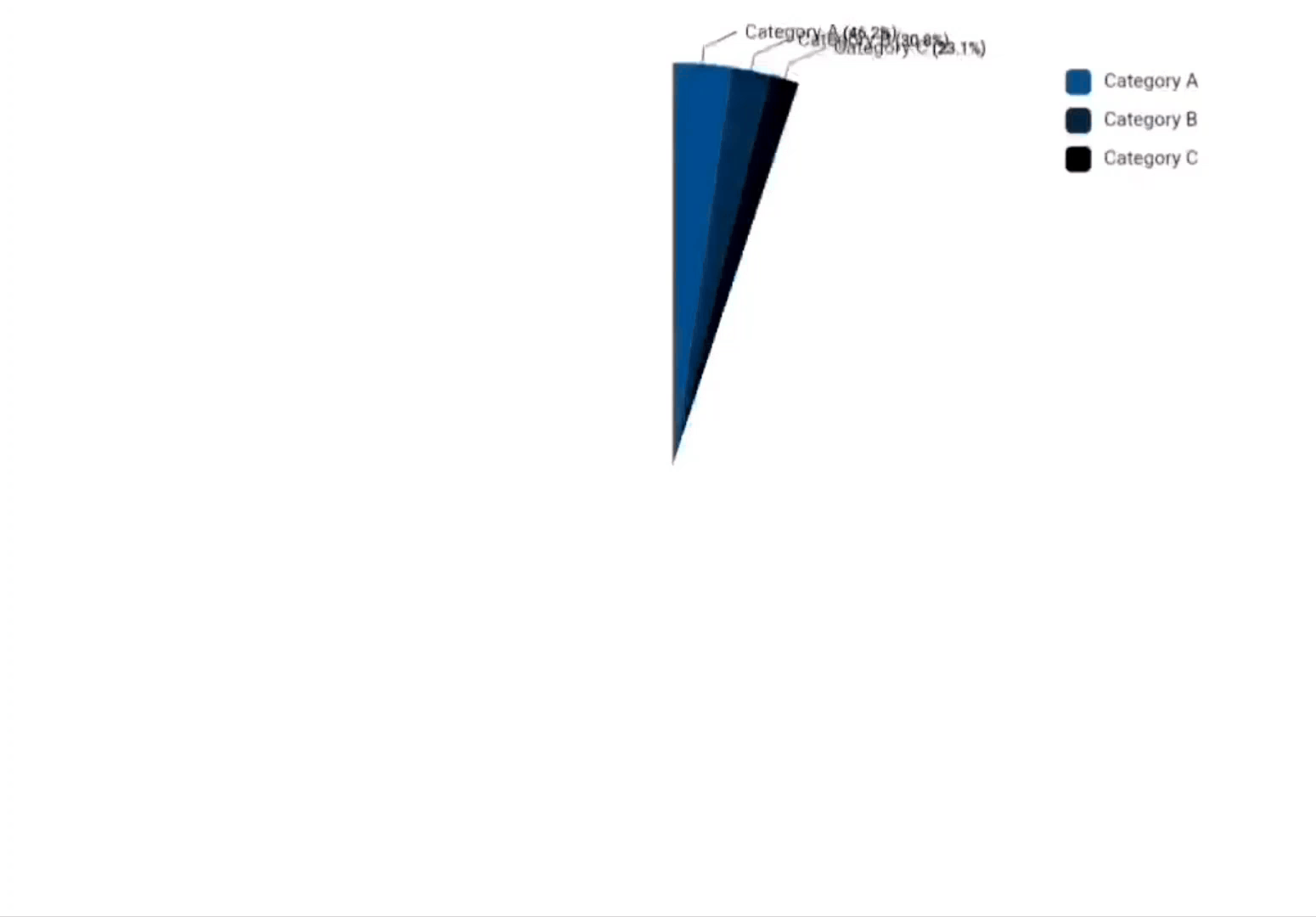
Usage final data = [
PieChartData(
value: 30,
label: 'Category A',
color: Color.fromARGB(255, 24, 86, 136)),
PieChartData(
value: 20, label: 'Category B', color: Color.fromARGB(255, 28, 60, 87)),
PieChartData(
value: 15, label: 'Category C', color: Color.fromARGB(255, 15, 27, 37)),
];
return MaterialPieChart(
data: data,
width: 400,
height: 300,
padding: EdgeInsets.all(50),
style: PieChartStyle(
backgroundColor: const Color.fromARGB(255, 223, 219, 219),
// holeRadius: 0.5, // Creates a donut chart
showLabels: true,
showValues: true,
showLegend: true,
),
);Properties PieChart Class Description PieChartData Represents a single segment of the pie chart, including value, label, and optional color. PieChartStyle Configures the appearance and behavior of the pie chart, including colors, labels, and animations. LabelPosition Enum defining the position of labels (inside or outside the pie segments). MaterialPieChart The main widget for rendering the pie chart with interactive and styling options.
MaterialPieChart Property Type Description data List<PieChartData> List of pie chart segments. width double Width of the pie chart widget. height double Height of the pie chart widget. style PieChartStyle Styling configuration for the pie chart. padding EdgeInsets Padding around the pie chart. onAnimationComplete VoidCallback? Callback for when the animation completes. interactive bool Whether the pie chart supports interactivity.
PieChartData Property Type Description value double The value represented by the pie segment. label String The label associated with the pie segment. color Color? Optional color for the pie segment.
PieChartStyle Property Type Description defaultColors List<Color> Default colors used for the pie segments. backgroundColor Color Background color for the pie chart. labelStyle TextStyle? Style for segment labels. valueStyle TextStyle? Style for segment values. startAngle double Starting angle for the first pie segment. holeRadius double Radius for a donut hole (0 for a full pie chart). animationDuration Duration Duration of the animation for rendering the chart. animationCurve Curve Curve of the animation. showLabels bool Whether to show labels on the segments. showValues bool Whether to show values on the segments. labelOffset double Offset distance for labels from the segments. showLegend bool Whether to display the legend. legendPadding EdgeInsets Padding around the legend. labelPosition LabelPosition Position of the labels (inside or outside). showConnectorLines bool Whether to show connector lines from segments to labels. connectorLineColor Color Color of the connector lines. connectorLineStrokeWidth double Width of the connector lines.
LabelPosition Property Type Description inside LabelPosition Label is displayed inside the pie segment. outside LabelPosition Label is displayed outside the pie segment.
Features 📊 Segment Visualization 🎨 Customizable Colors 🔄 Smooth Animations 📏 Interactive Hover Effects 🏷️ Dynamic Labels and Values 📋 Legend Support 🔗 Connector Lines 📅 Animation Duration Customization 🗺️ Label Positioning ♿ Accessibility Features ← Previous Page: Multi-Line Chart Next Page: Hollow Semi Circle →