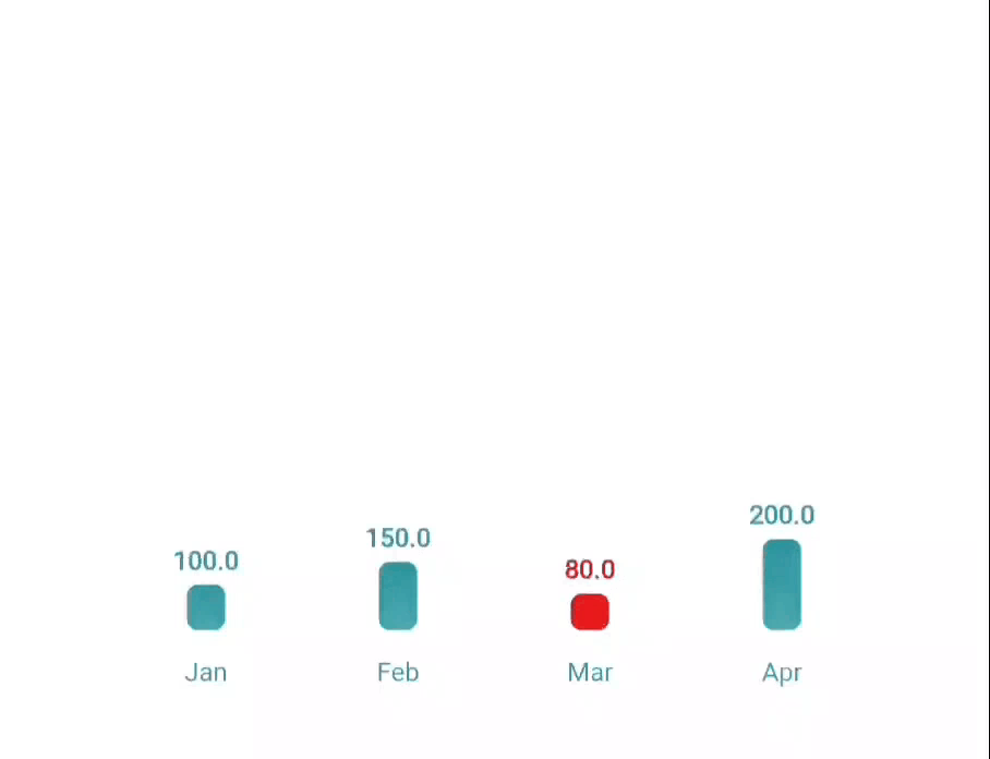
Bar Chart The Bar Chart component in the Material Charts Flutter package is a powerful tool for developers seeking to create visually appealing and interactive data visualizations in their Flutter applications. This charting solution excels at representing discrete data categories, allowing users to quickly grasp differences in values across various segments. With its user-friendly design, the bar chart enhances data analysis and decision-making, making it an essential feature for any application that relies on clear data representation.
Usage import 'package:flutter/material.dart';
import 'package:material_charts/material_charts.dart';
MaterialBarChart(
data: [
BarChartData(value: 30, label: 'Apples', color: Colors.red),
BarChartData(value: 70, label: 'Oranges'),
BarChartData(value: 50, label: 'Bananas', color: Colors.yellow),
],
style: BarChartStyle(
gridColor: Colors.grey.shade300,
backgroundColor: Colors.white,
labelStyle: TextStyle(fontSize: 14),
valueStyle: TextStyle(fontSize: 12),
barSpacing: 0.3,
cornerRadius: 6.0,
gradientEffect: true,
gradientColors: [Colors.purple, Colors.cyan],
),
showGrid: true,
showValues: true,
);Properties BarChartData Property Type Description Default value double Value of the bar Required label String Name of the bar Required color Color? Color of the bar Colors.blue
BarChartStyle Property Type Description Default gridColor Color Color of the grid Colors.grey backgroundColor Color Chart background color Colors.white labelStyle TextStyle? Text style for bar labels null valueStyle TextStyle? Text style for bar values null barSpacing double Spacing between bars (0.0 - 1.0) 0.2 cornerRadius double Corner radius of bars 4.0 barColor Color Default color for bars Colors.blue gradientEffect bool Enables gradient on bars false gradientColors List(Color)? Colors for gradient effect null animationDuration Duration Animation duration for the bars Duration(milliseconds: 1500) animationCurve Curve Animation curve for transitions Curves.easeInOut
Features 📊 Animated bars with hover and tap interactions 🏷️ Customizable bar colors and labels 📏 Optional gridlines and padding 🕒 Animation support with curve control 🌈 Gradient or solid color options Examples Basic Bar Chart MaterialBarChart(
data: [
BarChartData(value: 30, label: 'A'),
BarChartData(value: 70, label: 'B'),
BarChartData(value: 50, label: 'C'),
],
showGrid: true,
showValues: true,
);Styled Bar Chart MaterialBarChart(
data: [
BarChartData(value: 30, label: 'A', color: Colors.blue),
BarChartData(value: 70, label: 'B', color: Colors.green),
BarChartData(value: 50, label: 'C', color: Colors.orange),
],
style: BarChartStyle(
gridColor: Colors.grey.shade200,
backgroundColor: Colors.white,
labelStyle: TextStyle(fontSize: 14, fontWeight: FontWeight.bold),
valueStyle: TextStyle(fontSize: 12, color: Colors.grey),
barSpacing: 0.4,
cornerRadius: 8.0,
),
showGrid: true,
showValues: true,
); ← Previous Page: Overview Next Page: Stacked Bar Chart →