Multi-Line Chart The Multi-Line Chart in the Material Charts Flutter package is a powerful visualization tool designed for developers who want to display multiple data series simultaneously in their Flutter applications. This versatile charting component allows users to compare trends across different datasets, making it ideal for analyzing performance metrics, financial data, or any scenario where multiple variables need to be tracked over time. With features like smooth animations, customizable colors, and interactive tooltips, the Multi-Line Chart enhances user engagement and provides deeper insights into complex data relationships. Whether you're creating dashboards, reports, or any application that requires effective data visualization, the Multi-Line Chart in the Material Charts package is an excellent choice for delivering a rich and informative user experience.
Usage
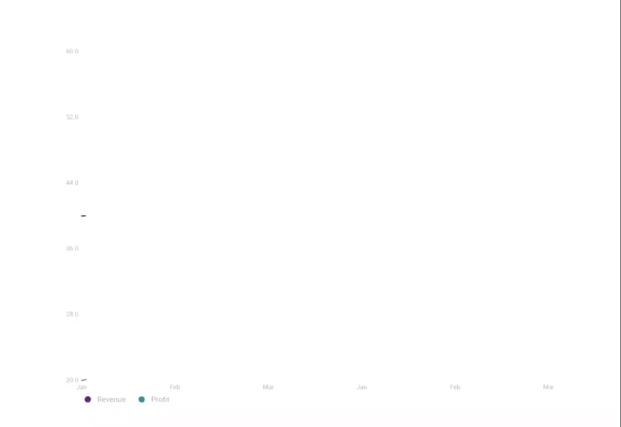
    final series = [
    const ChartSeries(
      name: 'Revenue',
      dataPoints: [
        ChartDataPoint(value: 40, label: 'Jan'),
        ChartDataPoint(value: 50, label: 'Feb'),
        ChartDataPoint(value: 20, label: 'Mar'),
        ChartDataPoint(value: 50, label: 'Jan'),
        ChartDataPoint(value: 40, label: 'Feb'),
        ChartDataPoint(value: 60, label: 'Mar'),
      ],
      color: Color.fromRGBO(116, 46, 149, 1),
    ),
    const ChartSeries(
      name: 'Profit',
      dataPoints: [
        ChartDataPoint(value: 20, label: 'Jan'),
        ChartDataPoint(value: 60, label: 'Feb'),
        ChartDataPoint(value: 55, label: 'Mar'),
        ChartDataPoint(value: 20, label: 'Jan'),
        ChartDataPoint(value: 60, label: 'Feb'),
        ChartDataPoint(value: 55, label: 'Mar'),
      ],
      color: Color.fromRGBO(46, 142, 149, 1),
    ),
  ];

  final style = MultiLineChartStyle(
    backgroundColor: Colors.white,
    colors: [Colors.blue, Colors.green, Colors.red],
    smoothLines: true,
    showPoints: true,
    animation: const ChartAnimation(
      duration: Duration(milliseconds: 5000),
    ),
    tooltipStyle: const MultiLineTooltipStyle(
      threshold: 20,
    ),
    forceYAxisFromZero: false,
    crosshair: CrosshairConfig(
      enabled: true,
      lineColor: Colors.grey.withOpacity(0.5),
    ),
  );

  return MultiLineChart(
    series: series,
    style: style,
    height: 700,
    width: 800,
    enableZoom: true,
    enablePan: true,
    // startYAxisFromZero: true,
    onPointTap: (point) {
      // print('Tapped point: ${ point.value}');
      },
  );
Properties MultiLineChart Class Description ChartDataPoint Represents a single data point with a value, optional label, and color. MultiLineTooltipStyle Configures the appearance of tooltips shown on the chart. ChartSeries Represents a series of data points, with optional line smoothing, colors, and line width. MultiLineChartStyle Styling configuration for the chart, including colors, grid settings, and animations. _LegendItem Internal class representing a legend item with text and color. LegendPosition Enum defining the position of the legend (top, bottom, left, right). ChartAnimation Configures animation settings for the chart rendering. CrosshairConfig Configures crosshair display settings, including color, width, and label visibility. MultiLineChart The main widget for displaying multiple line series with interactive and styling options.
ChartDataPoint Property Type Description value double The Y-axis value of the data point. label String? Optional label associated with the data point. color Color? Optional color for the data point.
MultiLineTooltipStyle Property Type Description textStyle TextStyle Style for tooltip text. backgroundColor Color Background color for the tooltip. padding double Padding inside the tooltip. threshold double Distance threshold for showing tooltip. borderRadius double Radius for rounded tooltip corners. shadowColor Color Color of the tooltip shadow. shadowBlurRadius double Blur radius for tooltip shadow. indicatorHeight double Height of the indicator shown on tooltip hover.
ChartSeries Property Type Description name String Name of the series. dataPoints List<ChartDataPoint> List of data points in the series. color Color? Color of the series line. showPoints bool? Whether to show points on the line. smoothLine bool? Whether to smooth the line between points. lineWidth double? Width of the line. pointSize double? Size of points if showPoints is enabled.
MultiLineChartStyle Property Type Description colors List<Color> Colors used for multiple series. defaultLineWidth double Default width for series lines. defaultPointSize double Default size for data points. gridColor Color Color of grid lines. backgroundColor Color Background color for the chart area. labelStyle TextStyle? Style for axis labels. legendStyle TextStyle? Style for legend text. smoothLines bool Enable smooth lines for all series. padding EdgeInsets Padding around the chart. showPoints bool Whether to display points on lines. showGrid bool Whether to show grid lines. showLegend bool Whether to show the legend. gridLineWidth double Width of grid lines. horizontalGridLines int Number of horizontal grid lines. animation ChartAnimation Configuration for chart animations. legendPosition LegendPosition Position of the legend on the chart. crosshair CrosshairConfig? Configuration for crosshair display. forceYAxisFromZero bool Whether to start Y-axis from zero. tooltipStyle TooltipStyle Style configuration for tooltips.
ChartAnimation Property Type Description duration Duration Duration of the animation for rendering. curve Curve Curve of the animation. enabled bool Whether to enable the animation.
CrosshairConfig Property Type Description lineColor Color Color of the crosshair line. lineWidth double Width of the crosshair line. enabled bool Whether to enable the crosshair. showLabel bool Whether to display labels on crosshair. labelStyle TextStyle? Style for crosshair labels.
MultiLineChart Property Type Description series List<ChartSeries> List of series to display in the chart. style ChartStyle Styling configuration for the chart. height double? Height of the chart widget. width double? Width of the chart widget. onPointTap ValueChanged<ChartDataPoint>? Callback for point tap interaction. onChartTap ValueChanged<Offset>? Callback for tapping anywhere on the chart. enableZoom bool Enables zoom functionality on the chart. enablePan bool Enables pan functionality on the chart.
Features 📈 Multiple Series Support ✨ Smooth Line Transitions 🎨 Customizable Color Palettes 🔍 Interactive Tooltips 📊 Clickable Legends for Series Selection 🗺️ Panning and Zooming Capabilities 📏 Grid Lines for Easy Reading 🔄 Animated Drawing of Lines 🗓️ Crosshair for Precision Tracking 📅 X and Y-Axis Label Customization ← Previous Page: Line Chart Next Page: Pie Chart →