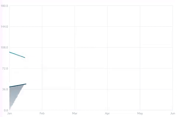
Area Chart The Area Chart in the Material Charts Flutter package is an essential visualization tool for developers aiming to represent quantitative data over a continuous interval in their Flutter applications. This powerful charting solution effectively illustrates trends and patterns by filling the area beneath the line, making it easy for users to understand changes in data values over time. With customizable colors, smooth animations, and interactive features, the Area Chart enhances user engagement and provides clear insights into data fluctuations. Ideal for displaying performance metrics, sales data, or any application that requires effective data representation, the Area Chart in the Material Charts package empowers developers to create a visually appealing and informative user experience while effectively communicating key information.
Usage MaterialAreaChart(
width: 600,
height: 400,
interactive: true,
style: AreaChartStyle(
// showGrid: false,
showPoints: false,
animationCurve: Curves.linear,
animationDuration: Duration(seconds: 1),
),
series: [
AreaChartSeries(
name: 'Company 1',
dataPoints: [
AreaChartData(value: 100, label: 'Jan'),
AreaChartData(value: 80, label: 'Feb'),
AreaChartData(value: 120, label: 'Mar'),
AreaChartData(value: 90, label: 'Apr'),
AreaChartData(value: 150, label: 'May'),
AreaChartData(value: 180, label: 'Jun'),
],
color: Color(0xff24909B),
// gradientColor:
// const Color.fromARGB(255, 243, 33, 51).withOpacity(0.2),
),
AreaChartSeries(
name: 'Company 2',
dataPoints: [
AreaChartData(value: 40, label: 'Jan'),
AreaChartData(value: 50, label: 'Feb'),
AreaChartData(value: 90, label: 'Mar'),
AreaChartData(value: 40, label: 'Apr'),
AreaChartData(value: 110, label: 'May'),
AreaChartData(value: 120, label: 'Jun'),
],
color: Color(0xff00284C),
),
],
),Properties Area Chart Property Description Type Default value Represents the Y-axis value of a data point. double - label Optional label for the X-axis of the data point. String? null tooltipConfig Tooltip configuration for the data point. TooltipConfig? null
TooltipConfig Property Description Type Default text Tooltip text. String? null textStyle Styling for the tooltip text. TextStyle Black, font size 12. backgroundColor Background color of the tooltip. Color White borderRadius Tooltip border radius. double 4.0 padding Padding inside the tooltip. EdgeInsets EdgeInsets.all(8.0) hoverRadius Radius within which the tooltip activates. double 10.0 enabled Whether the tooltip is enabled or not. bool true
AreaChartSeries Property Description Type Default name Name of the series. String - dataPoints List of data points for the series. List<AreaChartData> - color Color of the series line. Color? Automatically assigned gradientColor Gradient color of the area under the line. Color? Color with reduced opacity lineWidth Width of the series line. double? style.defaultLineWidth showPoints Whether to show data points. bool? style.showPoints pointSize Size of the data points. double? style.defaultPointSize tooltipConfig Tooltip configuration for the series. TooltipConfig? defaultTooltipConfig
AreaChartStyle Property Description Type Default colors Default colors for the series. List<Color> [blue, green, red] gridColor Color of the grid lines. Color Colors.grey backgroundColor Background color of the chart area. Color Colors.white labelStyle Style for the axis labels. TextStyle? null defaultLineWidth Default line width for series. double 2.0 defaultPointSize Default size for data points. double 4.0 showPoints Whether to show data points by default. bool true showGrid Whether to show grid lines. bool true animationDuration Duration of chart animations. Duration 1.5 seconds animationCurve Curve of the animation. Curve Curves.easeInOut padding Padding around the chart area. EdgeInsets EdgeInsets.all(24) horizontalGridLines Number of horizontal grid lines. int 5 forceYAxisFromZero Forces the Y-axis to start from zero. bool true
Features 📊 Visual representation of quantitative data over a continuous interval 🎨 Customizable colors and gradients 📏 Interactive points with hover effects 📅 Animation support for smooth transitions 🏷️ Customizable labels for data points 📈 Tooltip support for detailed data insights ← Previous Page: Candlestick Chart Next Page: Best Practices →